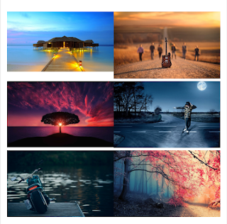
Image Gallery Code for Blogspot/Blogger Website
2-Column Images(Side by Side Photos) Code for Website
[<style>Add your Images in the place of above red line.Make sure that you choose none for Image alignment and choose any image size you want.For reference see the image below.
#sideBySidePics {
display: flex;
flex-wrap: wrap;
}
#sideBySidePics a {
flex: 50%;
}
#sideBySidePics img {
width: 100%;
box-sizing: border-box;
}
@media screen and(max-width: 420px){
#sideBySidePics a {
flex: 50%;
}
}
</style>
<br />
<div id="sideBySidePics">
<!--Add Blogger Images Here-->
</div>]
3-Column Images code for Blogger Website(Side by side Photos)
[lock]
[<style>
#sideBySidePics {
display: flex;
flex-wrap: wrap;
}
#sideBySidePics a {
flex: 33%;
}
#sideBySidePics img {
width: 100%;
box-sizing: border-box;
}
</style>
<br />
<div id="sideBySidePics">
<!--Add Blogger Images Here-->
</div>]
[/lock]
If you have any doubts are the code is not working comment your queries i will reply as soon as possible.Thank you for watch my post and i hope it will be more useful.
If you have any doubts are the code is not working comment your queries i will reply as soon as possible.Thank you for watch my post and i hope it will be more useful.


